Tag: type (page 1 of 2)


William Moran, from the Newberry Library
Way too many fabulous images from vintage Hungarian pocket calendars, via Present & Correct: Kartyanaptarak.
Petition to start using these names for tertiary colors…
This color wheel is from The Grammar of Painting and Engraving (1874) by Charles Blanc, translated from the French by Kate Newell Doggett.
Our current exhibition, Color in a New Light explores the Smithsonian Libraries’ collection through the topic of color. It’s on display in the Smithsonian Natural History Museum until March 2017, though you can visit the online exhibition, including a Digital Library for the exhibition.
Images from our new post, a visual history of colour wheels, charts, and tables: from simple circles to multi-layered pyramids, from scientific systems to those based on the hues of human emotion. Explore more here: http://bit.ly/1NBtj1E
houghtonlib: From the Houghton Instagram, a 1944 fine-press edition of Euclid designed by the great Bruce Rogers.
So beautiful.
Frontispiece to Charles Howard Hinton’s The Fourth Dimension (1904), a book all about the “tesseract” – a four-dimensional analog of the cube, the tesseract being to the cube as the cube is to the square. Find out more in our latest essay “Notes on the Fourth Dimension” – http://bit.ly/1Revr2B
nypl:
There are some swoon-worthy abstract motifs in our collections.
[Four abstract motifs.] via NYPL Digital Collections.
Relative visibility of colors at a distance _Graphic presentation_ 1939
This is important.
These gently animated book covers by Javier Jensen are wonderful! Via Open Culture.
Dan K Norris creates alternative movie and TV posters. Via Tim Carmody on Twitter.
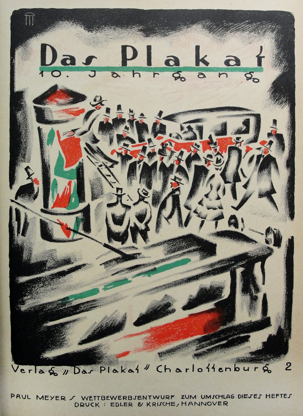
A look at the production and dissemination of posters from Das Plakat.
Read about the history of Das Plakat in Steven Heller’s U&lc article, Das Plakat: the voice of German poster design (1910-1921).
Via John Overholt, the permissible colors for decorating the interiors of Victorian neo-Gothic churches. It is necessary to avoid those garish colors that lead to “the utter destruction of repose.”
Hubert Saget, advertising poster for Leica, 1930. Printed for Optician Koch, Zürich, Switzerland. Via WestLicht
Miller Bros. 101 Ranch. Wild West Show. Daily review : program, 1929.
Houghton Library, Harvard University
Paul Bacon, 91, Whose Book Jackets Drew Readers and Admirers, Is Dead
“He didn’t see himself as a sensitive artist; he was there to serve,” said Mr. Gottlieb, who worked with Mr. Bacon for many years. “If you rejected the first one, he was happy to do a 10th one. We worked and worked until it was right.” […]
When describing his approach to design, Mr. Bacon said he had learned to subordinate his own aesthetic impulses to convey the main concept of a book. “I always tell myself: ‘You’re not the star of the show. The author took three and a half years to write the goddamn thing and the publisher is spending a fortune on it, so just back off,’ “ he said in an interview with Print magazine in 2002.
Here’s a nice appreciation from Steven Heller:
[W]hen you look at Bacon’s jackets en masse, you realize you’re looking at a history of late-20th century commercial book cover design, a virtual legacy of eclectic lettering, illustration and typography prior to the digital revolution. Bacon was, after all, a product of an era of hand-drawn lettering, and type that was cut and pasted in order to achieve precise spacing. While this sounds archaic in a time when layered Photoshop imagery is the order of the day, Bacon’s work was appealing precisely for its handcrafted precision (as well as minor imperfections) and spot-on conceptual acuity that evoked the story rather than isolated passage.
That’s one helluva portfolio. RIP.
Iconic book cover by Paul Bacon, who died Monday at the age of 91
I had both of these editions back in the day. Both books blew my mind, though in very different ways.
Chromatic Wood Type
Happy Typeface Tuesday! These wood type samples are chromatic specimens from the William H. Page Wood Type Co., produced in 1874.
Shown here from top to bottom, the wood types are titled: Renaissance, Etruscan, Gothic Paneled, and Corinthian.
More vital information here. Via John Overholt on Twitter.
“Yosemite and the Big Trees of California”
This advertisement, created in 1881, encouraged tourists to visit Yosemite in California. Yosemite was first visited by tourists in 1855 and was declared a U.S. National Park in 1890.
The death of Stephen the Protomartyr; woodcut from ‘Liber Festivalis’ (Oxford, 1486); Lambeth Palace Library
American wood type co., South Windham, Conn. [Specimens of wood type, 1885?]
Houghton Library, Harvard University
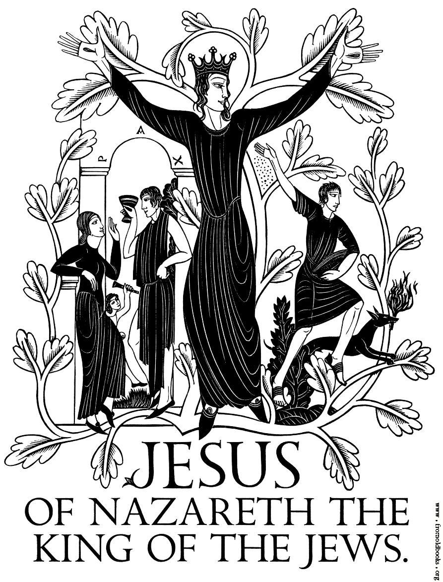
from Eric Gill’s Four Gospels
This is what book covers should look like.
Tips for the fancy [Thanksgiving] table courtesy The dining room and its appointment (1896).
They also have some helpful etiquette tips for dinner conversationGrievous or appalling events should not be mentioned, and mischievous gossip should be carefully avoided, as should also [sic] remarks of a political or religious nature that may be offensive to anyone present.
Poster for a 1917 production of Caliban by the Yellow Sands, a play written for Shakespeare’s tercentenary by Percy MacKaye. An outgrowth of MacKaye’s belief in community theater, it was first performed in St. Louis in 1914 with a cast of 7,000.
Harvard Theatre Collection, Houghton Library, Harvard University


.jpg)


